
Uncategorized
Gradients for Quilting
Mar
Like coloring, or painting, you can use fabric to create a fun and modern, realistic look to your quilt.
I prefer to use solids and low volume prints, as opposed to traditional calicos, because there is less competition for a focal point. But you CAN use your favorite calico; read on, for how!
I will show you an easy way to create a stress free gradient.
The first thing I want you to do is begin to think like a painter. You already ARE an artist!! This is another tool in your creativity belt! Start noticing things around you –
Where is the sun highlighting the flower, for example? Is the sun washing out all the color? Are the tips a different shade?
What color are shadows? When I started noticing light and shading in nature, I realized that shadows are not gray. They can be any color – very often blues, greens, purples, and sometimes pinks.
How about mountains? America, the Beautiful reminds us of “Purple Mountain Majesty”. If you have spent time on the plains, looking at the mountains, you may notice that sometimes, the mountains are purple, or blue, and other times are dark green or brown. The Smoky Mountains have bold to soft blues. The light changes how the color appears. It’s only when you’re really up close that you notice that the ground is brown!
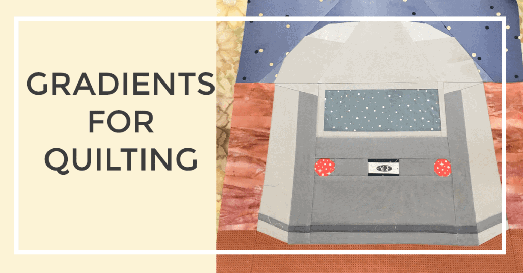
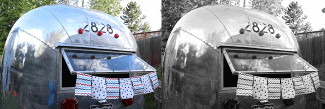
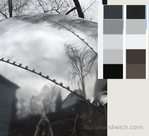
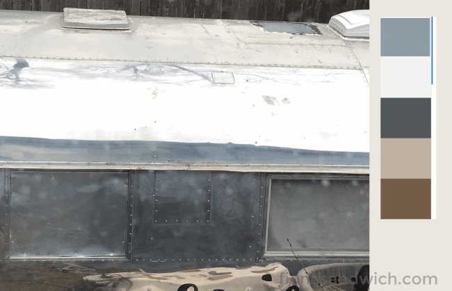
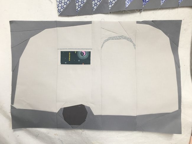
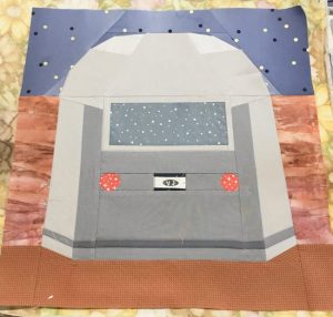
 Airstreams are a bit more tricky, particularly the ones that are polished. Light bounces off Airstreams in so many different ways. Whether your subject is an Airstream, or a flower, you can take a photo, and turn it black and white to see where the highlights and lowlights are. In my Airstream patterns, I have followed the panels, and divided them into sections where the light usually ‘hits’. You can draw on your pattern pieces which color you want to use in each section so you have the best results.
Your fabric choice will influence the look of the block. If you mix a solid with a dense print, it can have a disconnect, and not have a ‘realistic’ look. I would use low volume and solids together on one area, like the Airstream, or a flower, for example, and something of higher volume for the ground.
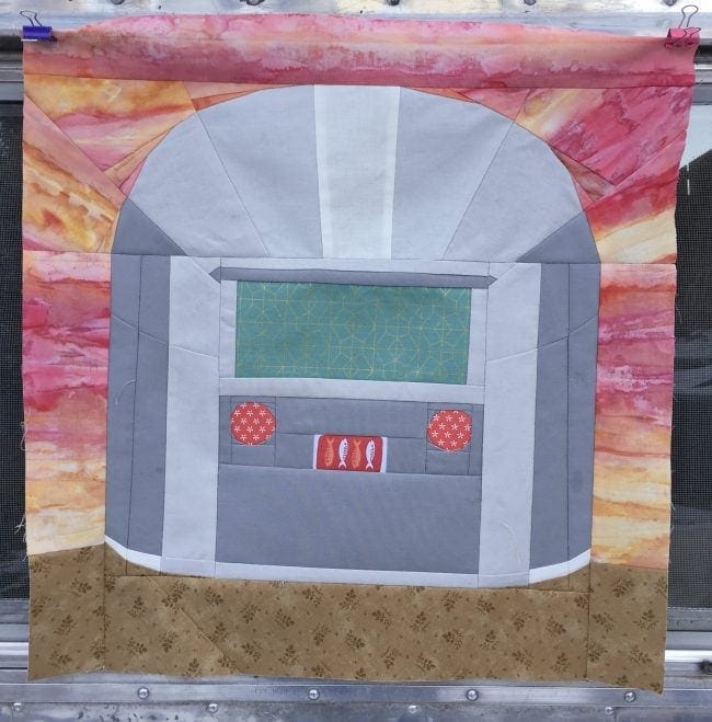
 The key is to keep the eye moving. It could be more tricky to achieve this if the WHOLE block is a dense calico. Think about where you want to focus? Is it the Airstream, or the sunset? If it’s the sunset, use a vibrant ombré or batik, and keep the Airstream in solids. BUT! You can still have something of interest in the window and license plate…these are the details that draws the viewer in, and keeps the eye moving. It’s creating balance in the ‘painting’. If you have too much going on (say for example, a vibrant sunset, and a fun calico for the trailer), it’s too much for the eye to focus on. It creates a disconnect.
Let’s say that you have a unique calico, or a wild low volume that you want to use for the trailer – let THAT be the focus, and the background shouldn’t be as loud. It should…well..fall into the background!!!
This is contrast. You have to have darks and lights, it creates visual interest!!! You don’t want the quilt to look flat, or boring. By using a variety of contrasting colors or shades of colors, your quilt will have an artistic look, instead of a flat look. Your eye will have a place to land.
How do you select colors for gradients?
 I mentioned turning a photo to black and white to see the highlights and low lights. You can also go to the home improvement store, and get paint swatches, then to the fabric store to select colors. This is something that I do. Take a photo with you, and zoom in on the areas you’ve decided are highlights and low lights. Select paint swatches that are close colors…then head to the fabric store. I am encouraging you to try a new technique…so don’t get hung up on getting the colors EXACT!! The eye will fill in the details.
Have fun selecting fabrics, and colors. Think about what else might be going on around the Airstream, for example. Where are the low lights? (Under the trailer, under a rub rail, under eyebrows) Where are the highlights? (Wherever the sun is shining down).
I have a polished Airstream, and I’ve noticed that it reflects EVERYTHING around it!!! When the sun shines down, that area is WHITE WHITE. But the sides might be blue, or green. You could try using a landscape fabric in this area! How fun would that be!? I’ve heard it said about free motion quilting, “Once is a mistake, twice is a design choice.” But whatever you select for your gradient, is a design choice!! There really are not wrong answers.
It may be easier to look at Airstreams that are not polished. The light reflects in a different way, than on a polished Airstream!
Here are a few examples. This is the same trailer, same day…different colors that are picked up. (I used an app called Adobe Capture. You’ll need a free Adobe account. It’s really an incredible app. You can point it at any object, and it will give you 5 harmonious colors!! The disadvantage is that it wants to choose a nice balance, so you may have to get closer to the object to be able to choose only the colors you want (like gray), or it will pick up on the reflections or lights, or the background – which can also be really helpful for selecting pleasing shades for backgrounds. DO be sure to take a screenshot of what you’re pointing the camera at, and take a screen shot of the color swatches! This could save you a trip to Home Depot!!)
Does every area need to be another color?
NO! Definitely not. Close enough is good enough. If this is new to you, I’d suggest NOT being exact in each area being a different shade of gray. You’ll drive yourself batty!! I’d suggest 2-4 to start. As you get more comfortable with gradients and shading, you can become more detailed with your color selection.
What happens if you don’t like the finished result?
You learned! You tried something new!! Do it again, and again, and again, and you’ll get better at it. I promise!!!
I find with foundation paper piecing that I have more fun, and am less stressed about fabric selections if I write down on the template what color goes in each section. EVEN IF I color on the coloring sheet, I find that I forget what goes where…or forget that the end result will be the mirror. Somewhere in my quilting journey, I let go of my need to have the quilt look the same as the picture. Meaning – if the end result is the mirror of my inspiration picture, that’s ok! I would much rather have seams that match, than have the sunlight highlighting the exact same area as my inspiration picture. Close enough is good enough (again, piecing withheld)
I would NOT spend the extra time flipping an image, or heaven forbid, writing on the left hand side of the block, for what ‘really’ goes on the right. THAT is a brain nightmare in my book. So I want to release you from that stress.
I lay all my template pieces out to create the picture, with the printed side up. Then I look at my inspiration picture, and if the highlight is on the upper right of the trailer, I will write the fabric color I use there. You will see this in my tutorials. I don’t do this for your benefit as much as mine! 😛 I don’t need to be a superhero quilter…and I’m not above short cuts!
Sometimes I lay a bit of the fabric under my paper templates to remind me what goes where.
And if I’m working with very slight nuances, I keep them separate. For example, I’ve been using Kona Shadow and Silver. The differences are SO slight, that I keep them in the bags (with the labels), and try to work with only one shade at a time.
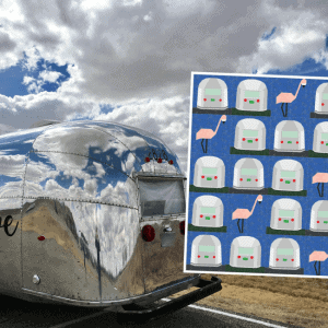
Get the Airstream patterns so you can practice gradients! Click on the images below.
Pingback: How to Fussy Cut & Foundation Paper Piece | Fiona Sandwich