Uncategorized
The 9 Fabrics I Started My Quilt With
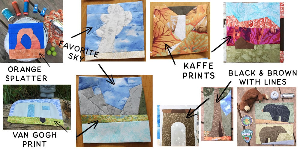
When I started making the National Park patterns, the one color I didn’t have was brown. I had strong opinions about brown (in that I didn’t like it). I bought 2 brown Kona solids, an orange with a splatter print, a sky fabric (which ended up being my ABSOLUTE favorite), a black with some lines, the same one in brown, 2 Kaffe Faucett prints: one in orange and the other in pink, a green Van Gogh print (Kauffman Painterly print). That’s it. 9 fabrics. And all fat quarters. I probably spent less than $30. And that gave me about 2 yards to work with. For 4.5” blocks, that is ROUGHLY 16 blocks per 1/4 yard. This math is really rough, because some blocks use more fabric and some use less…but out of 2 yards, you could get about 264 blocks. From NINE fabrics. You’ll probably get tired of those fabrics long before you use them up!
I didn’t have a huge stash to start. I would still consider my collection to be pretty small. I don’t buy yards and yards at a time. I prefer fat quarters; they take up less space. But I had scraps, a few jelly rolls, a handful of bundles. I used (and still use) what I have on hand. SOMETIMES I hunt for the perfect fabric, but most of the time I use what I have.
You see the design dictates what will be interpreted. You don’t need to have one color for Arches and another color for Guadelupe Mountains – the design will tell you, “Oh yes, I see it!”
What to Look For
Whether you are shopping your stash or going to the fabric store, look for small prints, loose prints, blenders, batiks, and solids. Feel free to use something else from your stash if it ‘speaks to you’!!
Look for fabrics that could be used in multiple ways, as I did with the brown and black line fabric (I think this is a Rae Ritchie print. I pick up a bit whenever I see a new color! Still one of my favorite fabrics because it’s so versatile). Look for the suggestion of something. Could it be used for bark AND fur?! Could it be used for water AND sky? Fabric is your paint. How can you use the print?
What do you “see” in the print? Could the veins be used to show rocks? Could the print be turned sideways to illustrate water? Could the print show snow in the mountains? Don’t look for exact representations. Let your imagination run wild.
In the words of Ms. Frizzle, “Take chances. Get messy. Make mistakes!” You’ll have SO MUCH FUN! I promise!
Start Here
Start with where you have been. I live in Colorado, so I’ve visited more western sites than eastern units. If you’ve been to more coastal sites, you’ll probably want some blues that are the colors of the water. Rocks aren’t all brown, so don’t feel like you need to have lots of brown in your quilt. I use purple, and blue for rocks, depending on what I want to show in my block. Look through your stash – what colors do you have that are similar to where you’ve been? Not the prints, but the colors.
Start with what you see. For example, during the day, Colorado National Monument is very orange: this is where I would start. But at sunset or sunrise the colors are completely different. Rocks then can be purples AND oranges. Don’t get bogged down with selecting fabrics that are exactly like what you see in your pictures. Choose fabrics that suggest or are similar in color (even if the print isn’t a mirrored representation)
If you don’t know how to paper piece, I recommend focusing on learning the method (either one), then dive deep into creating blocks that look like where you’ve been. I find that I can do one new thing well. Two things alright, and anything more than that is asking too much. I get stressed. I make mistakes. Then get frustrated. So I’ve found that I do best when I focus on one new thing. Give yourself grace as you learn. Both methods are simple to learn, but take practice. If you are really focused on learning AND making a masterpiece, you might get frustrated and give up. Start with the park sign (the trapezoid included in every pattern)
Start with scraps of fabric so you don’t feel like you are wasting anything. These patterns work really well with teeny tiny scraps that you might usually throw away.
And finally, start with the park sign pattern. It’s included in every NP pattern. It’s there for you to practice with (as well as a place for your patches!!)
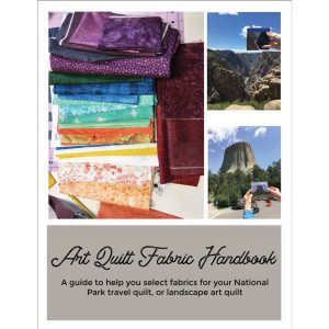
Do you feel like you need more guidance selecting fabrics? My Art Quilt Handbook – it is a comprehensive guide to selecting fabrics from the quilt shop or your stash.