
Uncategorized
Capture the Beauty: Fabric Ideas for Glacier National Park
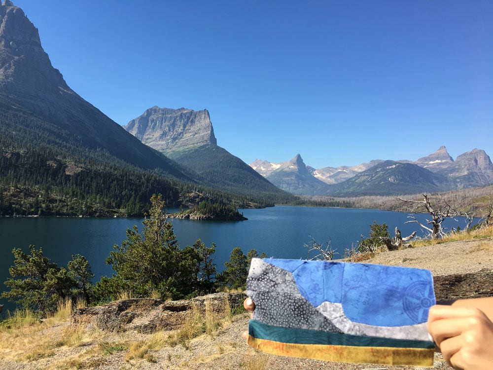
In this blog post, you’ll find some helpful tips for making the Glacier National Park project in Quilts and More magazine. Creating a realistic block is much easier than you think. To start, look at some photos of Glacier – notice the colors and the textures of the mountains, sky, foliage. If you are looking for a particular season, put that in your search too; it will change the photos you get.
The goal is not to copy…the goal is to create a block that says “Glacier” without being exact. I have found over and over that if I try to copy the location exactly, my block turns out very boring. So when you look for fabrics in your stash, look for color first, then texture. I’ve found that if I nail a color, the block turns out the way I want to. So if you were making a slot canyon block, it would be best to choose colors that are right for the different layers, rather than using a batik with lines for the layers…the block will turn out jumbled.
When I pull fabric, I start with one area. Generally the mountains, or whatever I want to have as the focal area. If you want the sky to be the focus, then start there. Sometimes I start with one fabric, and I end up not using it (see my video on selecting fabrics for Redwoods); this is normal! While you are thinking of mountains, go through your stash to see what seems like it could be mountain-y.
I really like blenders, and small prints. Don’t get hung up on using rock fabric for rocks. Look for over all texture prints that suggest what you are after. There isn’t anything wrong with using rock fabric for rocks, but it’s limiting, and may have the effect like my slot canyon example.
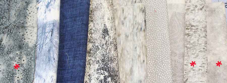
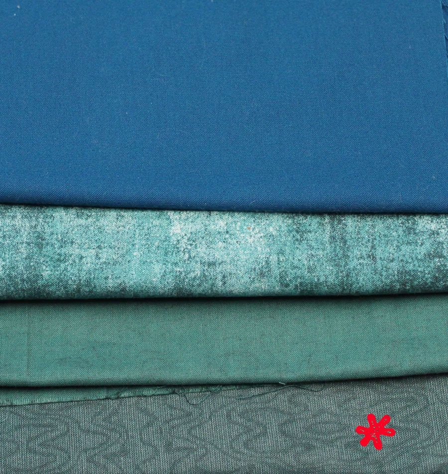
For the mountains, I pulled several grays and blues. In landscapes, what is in the foreground is the brightest, and things become lighter and more muted as they recede. So I was looking for 3 colors that worked well together that would be bolder in the foreground, and more muted in the background. I settled on a blue batik, a mottled gray, and a marbled gray (working from left to right). The fabrics I chose are denoted by asterisks.
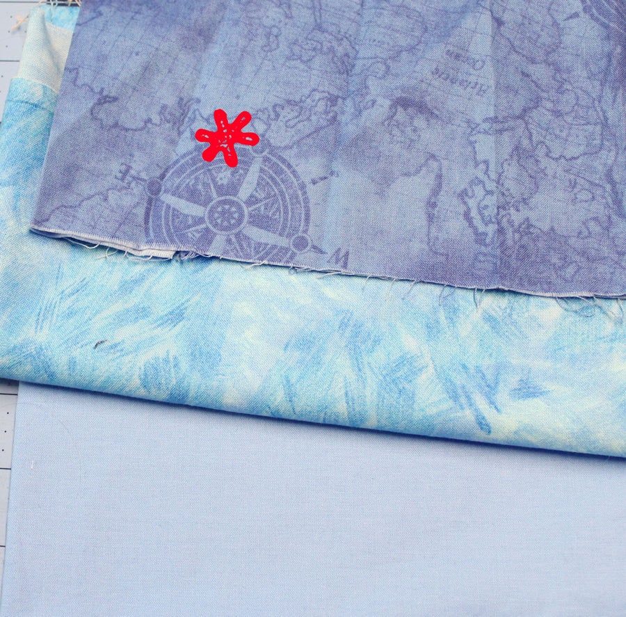
I was really content with the mountains, so I moved onto the sky. All the other fabrics should support the focal area (in this case, the mountains). As you go about your day, start to notice colors. What color is the sky before a storm? After a storm? On a warm summer’s day? Even when you travel, you may notice that the colors around you are different. I wanted to make sure that the sky fabric wasn’t going to compete with the mountains fabrics. If I would have used a fabric with clouds, it would have competed with the mountains, and looked jumbled. If you look at your fabric selection and something seems off, you probably have a fabric or two that is competing with the focal area…so try a different fabric. I chose a crisp tone on tone blue. Another word I like to use is “suggestion”. We want the block to have a suggestion of movement in the sky. Before selecting this, I had a solid blue, and it felt like it was lacking.
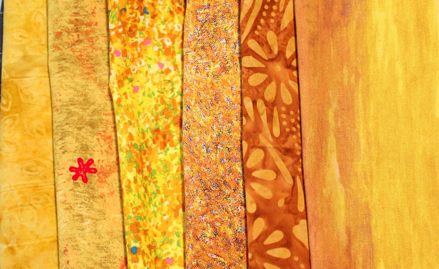
Now onto the foreground. I was thinking autumn thoughts…rich oranges and yellows…So I went through my stash (I have my fabrics organized by color to make it easier to hunt for the perfect color). I pulled batiks and prints…and referenced photos…and put back all the oranges. It didn’t have the right feel. So I selected a grass like yellow. Perfect.
 Then the water – you could choose to make this a meadow too. If you did that, use a lighter, and more muted shade of whatever you selected for the foreground. The color of water also changes in the seasons. There is a lake by my house, and it’s so interesting to notice how the color changes in the different seasons. In fall, water becomes a deep teal. I have 2 fabrics in my stash that are teal – one is this taffeta print (not my fave, but it suggests water moving, and keeps the eye moving) and the other had small black flowers. Obviously, the taffeta print won. TIP: turn the fabric in different directions to “see” what else you could use a fabric for.
Selecting fabrics can be tricky; I have created a free swatch finder to help you determine if the scale will be right for your block. Enter your email address below, and I’ll send it to you.
I would love the swatch finder! Thank you!
Hi Cheryl – would you try reloading the page? It appears that the place where you add your email disconnected. It looks like it’s working again!